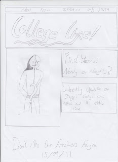
I have chosen to do the skyline in white writing and black background because it will stand out. I plan to have the title as black and bold, on a white background, again so it stands out amongst other magazines on a shelf. The picture relates to the first and most attractive, the main seller side heading, showing what it will be talking about. The writing in the side headings and the sell line in the same font but smaller of the title.

No comments:
Post a Comment