Welcome
Welcome to my AS foundation portfolio blog. Here you will find research and planning, construction evidence, and evaluation for my coursework projects.
Tuesday, 20 September 2011
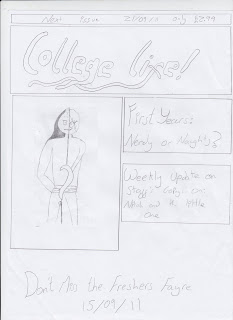
Prelim Task Magazine Cover
I have chosen to do the skyline in white writing and black background because it will stand out. I plan to have the title as black and bold, on a white background, again so it stands out amongst other magazines on a shelf. The picture relates to the first and most attractive, the main seller side heading, showing what it will be talking about. The writing in the side headings and the sell line in the same font but smaller of the title.
Prelim Task Contents Page
I have chosen to have the actual contents on the left hand side because it attracts the readers attention quickly. The contents headliners will be in a black box with white writing, and the writing underneath will be the opposite. The subscription details would be the same as the headliners. The pictures shows the college and how everyone is having a good time.
Wednesday, 14 September 2011
Tuesday, 13 September 2011
Kerrang Magazine Contents page
Following the Kerrang colour code, the contents page also only use greens, blacks and whites. it has a main image of a popular artist and its page number. i presume that the artist is very popular and seeing his close up face will help sell the magazine. it also shows the subscription details on the cover in the top corner, so a viewer knows where to get it regularly. It also clearly shows the page numbers to different and the most important articles.
Kerrang Magazine Cover
The "Kerrang!" in the background adds attention to itself as it is on a dark background and its text is white, making it stand out from other magazines. It, like other magazines, follows the rule of three, and only uses three colours - green, white and black. the picture of Slipknot at the bottom is made to stand out via being in a green box. it also has a referance to a new film which came out a few months prior to the magazine release, the harry potter films, this could attract a wider range of viewers.
Empire Magazine Contents
The center of the page is where the eye naturally looks first, so Empire has put all the contents they think that will sell the magazine, right in the middle, cramming as much into it as possible. They also only use three colours in their text - black red and blue. It also has a mini-description of all the main articles, but with a sense of humor to the text, which sums up the magazine.
Empire Magazine Cover
I like how in this image "EMPIRE" is in big red letters, it makes it stand out among all other magazines on a shelf. The magazine cover only uses three colours - red, white and black. The reason being it keeps it simple and more dramatic. The font text is very sharp, more than likely relating to the character's claws. The way that Wolverine is above any of the text again makes it stand out, as though he is actually coming out of the magazine, making him seem more dramatic and powerful.
Monday, 12 September 2011
Breif Print
Preliminary Task: Using DTP and an image manipulation program, produce the front page of a new school/ college magazine, featuring a photograph of a student in medium/ close up plus some approximately laid out text and masthead. additionally you must produce a mock up of the layout of the contents page to demonstrate your group DTP.
Monday 12th Task: The front page, and contents page and double page spread of a new music magazine.
A minimum of 4 images must be used. all images and graphics must be produce by the candidate.
Monday 12th Task: The front page, and contents page and double page spread of a new music magazine.
A minimum of 4 images must be used. all images and graphics must be produce by the candidate.
Thursday, 1 September 2011
Subscribe to:
Comments (Atom)


